Celebrating women artists, activists, writers, performers, community groups and organisations, with a diverse programme of…
Using Cartography Techniques and Person-Centred Approaches to Enhance Creative Health: Exploring the Significance of Colour in Arts and Health Workshops
The Significance of Colour in Creative Health Workshops: Exploring Semiotics and Cartography Techniques
At AC&H, we have recently initiated a sequence of community workshops that utilise cartography techniques and person-centred approaches to enable storytelling and investigate pre- and post-COVID worlds. Initially, these workshops were part of a Socially Prescribed program in Palliative Care hospices, but now I am testing their potential in different settings. Incorporating colour in Creative Health workshops is a strategy to enhance emotional and social wellbeing by using the power of colours to encourage self-expression, introspection, and social interaction. The workshop’s structure can be adapted to various settings and topics. It can lead to multiple creative outcomes, such as art installations, devising stimuli, or performances.
Colour has always been a source of fascination for me, and its ability to affect and transform the world around us is something that I find particularly intriguing. Having been diagnosed with Dyslexia and Visual Processing Disorder later in my life, colour has now become an integral part of how I perceive and comprehend my surroundings. As I now heavily rely on colour as a support system, it has become a crucial factor in helping me function and interpret the world around me. My interest in this topic has prompted me to delve into the significance of colour in my workshops and share some insights on the knowledge I have gained.
“The understanding of signs is not a mere matter of recognition; it is a matter of interpretation.” Umberto Eco, Semiotics and the Philosophy of Language
Semiotics is a multidisciplinary area of study that analyses signs and symbols, and how they are used and interpreted. It explores the ways in which signs and symbols communicate meanings and how those meanings are constructed through cultural and social practices, drawing from fields such as linguistics, psychology, philosophy, and anthropology.
While the connections between signs and their meanings may sometimes appear obvious, they may seem erratic and anarchic at other times. By recognising the significance of participants’ choices and responses to colour as an integral part of the creative process, we can develop more nuanced and well-informed activities that effectively convey the intended meaning.
Medical semiotics highlights the significant role of colour in various aspects of healthcare. For instance, colour’s influence on a patient’s wellbeing has been demonstrated in environmental design. Medical imaging also uses colour to identify areas of concern and aid in image interpretation. In MRI, contrast agents may be colour-coded to enhance the detection of specific tissues or structures. Additionally, colour-coded systems are commonly employed in healthcare to identify equipment, supplies, and medication, reducing the likelihood of errors by facilitating correct identification.
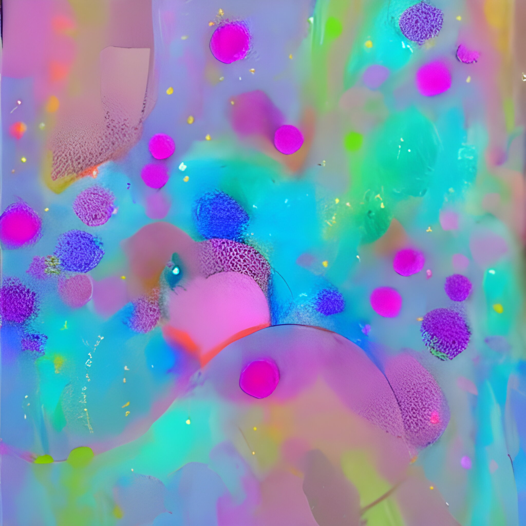
In cartography, the use of colour is crucial in conveying information and meaning in maps, as it can represent various features, such as terrain, elevation, vegetation, land use, population density, and political boundaries. For instance, in maps representing vegetation, shades of green are frequently used, while different shades of blue can represent water bodies. In health or population maps, warm colours such as red, orange, and yellow are often used to depict areas with high population density. By utilising colours, it is easier for map users to comprehend the presented information and identify patterns and trends, which is why it also plays a significant role in the workshops.
Exploring Colour Pairing and Scheme Selection in the Creative Process
In this workshop, I encourage participants to reflect on and challenge the reasons behind their choice of colour and observe if their choices change over time during the course of the workshop. In the second stage of the workshop, participants are asked to consider how they pair colours together. For instance, a participant once stated, “light blue and white together look cold, and that’s how I feel about this situation.” The selection of colour schemes in these workshops is crucial as it can impact how the map is interpreted. Contrasting colours can be used to highlight differences between various features or experiences, while similar colours can be used to indicate areas of similarity or continuity. This is a significant aspect of cartography that I incorporate into my workshops. Participants are asked to select colours associated with the topic at hand or the conversations, experiences, or emotions being discussed. These subtle differences in colour choices allow us, as the audience, to interpret what the creator intends for us to experience. Other aspects of visual appearances, such as gloss, texture, translucence, and patina, can also influence perception and reaction, further contributing to the interpretation panel.
Navigating Boundaries and Approaches for Interpreting Participants’ Choices of Colour
As a facilitator in these workshops, it’s important to note that I am not diagnosing or interpreting the participant’s expression of a certain colour. Open-ended questions are asked to avoid projecting personal experiences or feelings onto the interpretation of the colour. These workshops are not a form of therapy and should not be treated as such, but rather focus on exploring the unconscious choices of colour and their meanings. Personal experiences and cultural backgrounds bring unique perspectives to the interpretation of colours, which is why setting boundaries and reassuring participants of their freedom to choose is important. Fictional stories or experiences can be used to maintain comfort levels, and I use the Drama Spiral by Dr Clark Baim as an approach that can be used to further support participants. It is necessary to recognise that colours are not perceived in a vacuum and are impacted by various factors that can evoke emotions and reactions. These workshops are held for Arts and Health purposes, rather than as Art Therapy or Arts in Health. The interaction between what’s happening in the room and the visuals used are equally important. It’s important to note the limitations of semiotics, as not everything can be fully understood and described in these workshops and subsumed within a realm of coherent understanding instead of recognising that much of what is described in these workshops is fleeting and certainly momentary.
The Benefits and Considerations of Cartography Workshops with Colour Integration and Person-Centred Approaches.
In conclusion, these workshops that utilise cartography techniques and person-centred approaches with the integration of colour have the potential to enhance emotional and social wellbeing, and investigations. By recognising the significance of participants’ choices and responses to colour as an integral part of the creative process, we can develop more distinct activities that effectively convey the intended meaning. However, it is important to note the limitations and complexity of using colour and to set boundaries and reassure participants of their freedom to choose. These workshops are held for Arts and Health purposes and provide a unique perspective on the interpretation of colour and its impact on individuals. As a facilitator, it is essential to maintain a safe and comfortable environment for participants to explore their unconscious choices of colour and their meanings. Overall, these workshops offer a unique and creative approach to exploring and understanding the world around us through the use of colour and the model of the workshops can be used in a range of settings, topics, and creative outcomes.
Related Posts